Frost consultancy.
A project for a technology consultant.
The aim of this project was to create a new identity which suited the client’s vision. I was asked to design a logo, website and business card for his company. Because Frost is a technology consultant I wanted this to be visible within the design. After a short time, I came up with the following concepts:
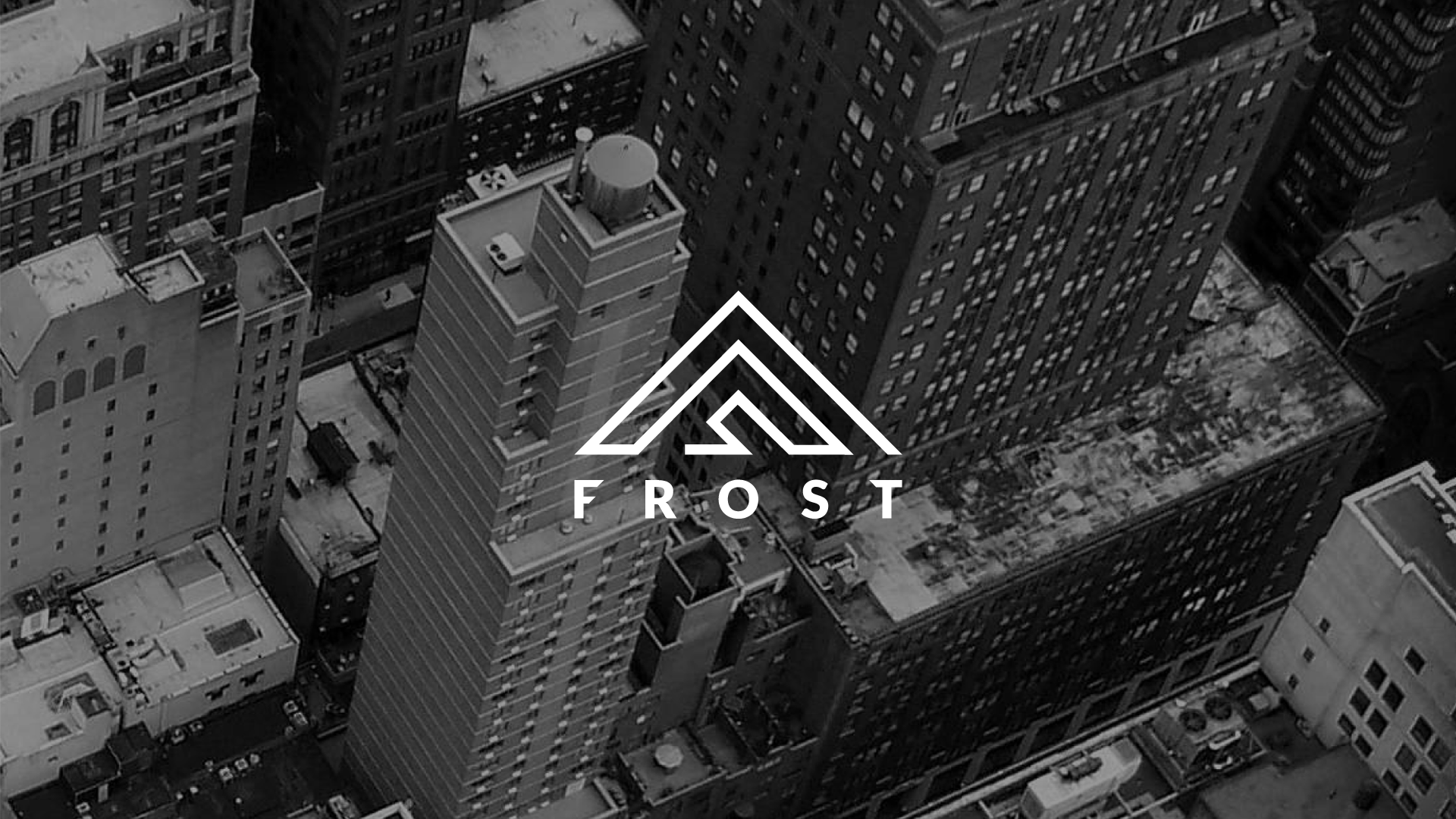
I used a mountain as the main focus of the design to show the client is the pinnacle in his industry. This also linked in to the name as Frost/Ice is found at the top of mountains. The 45 degree turned 'F' of Frost represents the top of the mountain and the use of lines designates technology.
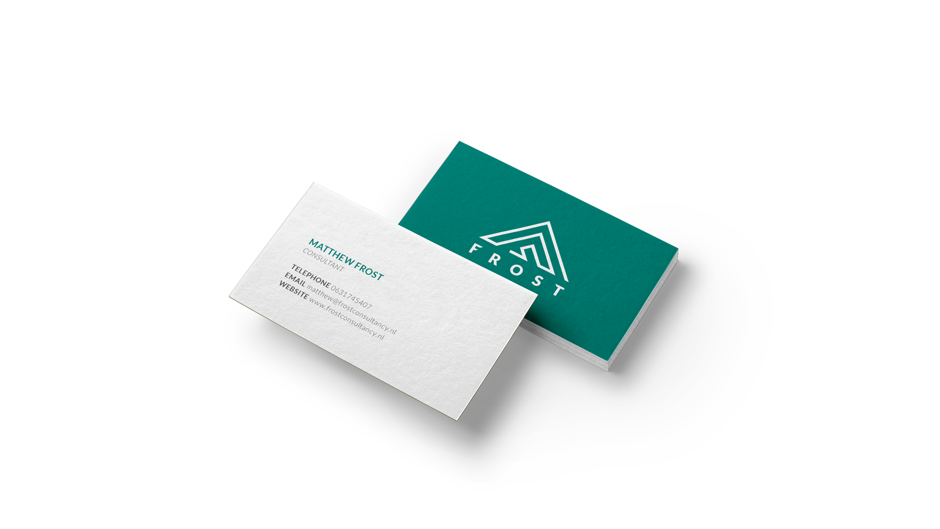
Keeping the same core themes throughout the design was important to me to show a unified direction.
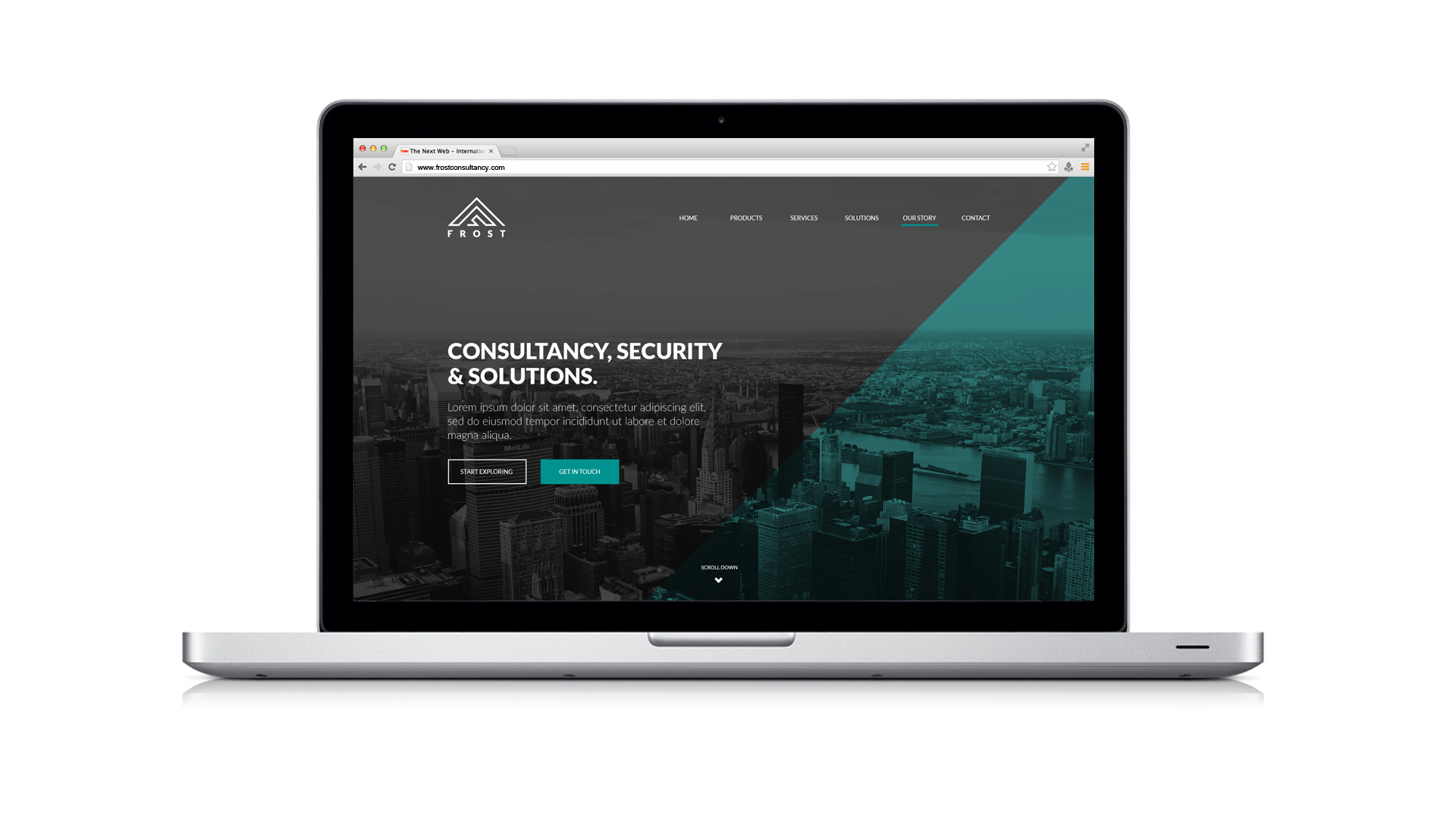
I used the same colours and shape directions in the web design as in the logo.
To communicate with the audience, there's an intro on the homepage to show the visitor where they are and what they can expect.
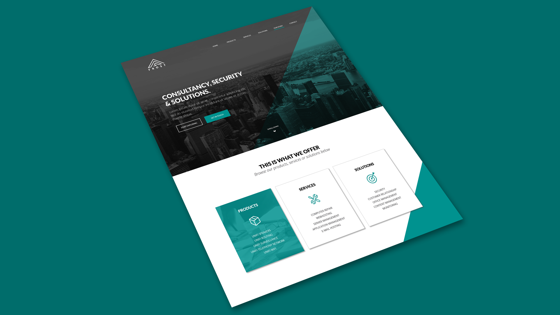
There are different call-to-action buttons, hovers and other elements that guide the visitor throughout the website.
The aim was to be user friendly, clear and concise whilst remaining fresh.
Get in touch
Do you want to know more about me, my work, my interests or do you want to say something else? Feel free to message me..
Almelo, the Netherlands